Project Date: March 2019
Website: https://www.executivensight.com/
Project Overview
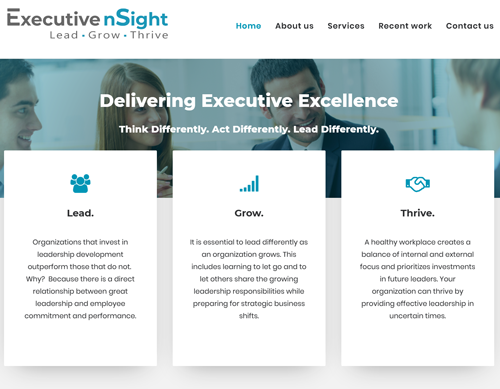
An executive coaching company in San Jose, CA was busy and thriving, but needed a complete image refresh. They had an existing website built in the early 2000’s, a dated color scheme, and an older-style logo design. The president wanted her visual identity to better match her values and brand, and needed it to convey:
- Clarity, calmness, and competence
- A feeling of security and trustworthiness
- The company’s thorough understanding of current technologies to underscore her technical competence
Key Project Elements
Brand Discovery
Through in-depth personal interviews with the managing partner, aided company to clearly articulate what their company brand represents and how that translates into value for their clients.
Website Design and Programming
Completely redesigned the website look using wireframes, color palette choices, and three different design comps. Site was built in WordPress, allowing the company to update it on their own.
Graphic Design
Designed new logo, providing several approaches and color palettes. Revised corporate collateral including business cards, letterhead, and PowerPoint template. Found and customized stock photos.
Copywriting and SEO
Using the brand identity to define content, wrote all copy on website using SEO best practices and translated this content to an updated LinkedIn profile - crucial for company's marketing efforts.
Key Results
-
Website Design Results
Created a soothing and clean design in order to calm prospective clients who may be visiting the site during a time of stress.
Programmed site in WordPress using a responsive design to ensure it would be appealing on any platform.
Provided a one page web design to allow ease of viewing on multiple devices by reducing the number of “clicks” required to get to the desired information. -
Brand Discovery Results
Conducted intensive “interviews” with the company president to elicit information on the company’s brand identity.
Identified the value that the company brings to clients.
Wove brand identity and value propositions into all materials including stock photos, color scheme, and copy. -
Logo Design Results
Transitioned to a blue-centric color scheme to provide a calm and trustworthy image.
Designed a “wordmark” logo (one with interesting fonts, but no iconography) to emphasize a tagline, which would quickly help convey the company’s value.
Since logo design trends tend to morph over time, using a wordmark-style logo would also help ensure a longer lifespan for the visual identity.


